
AC Milan’s latest away kit is more than just apparel; it is a visual homage to the club’s deep-rooted history and iconic symbolism. Central to the design is the “Diavoletto,” the mischievous little devil mascot that has been intertwined with Milan’s identity since its inception 125 years ago. By reincorporating the classic crest — notably, the vintage stylized devil logo — the club aims to evoke nostalgia among its long-time supporters while simultaneously embracing its storied past. This deliberate nod to history demonstrates Milan’s recognition that their past achievements and symbols form an integral part of their identity, even in a rapidly evolving football landscape.
Design Philosophy: Simplicity Meets Sentimentality
The jersey’s minimalist aesthetic signifies a purposeful shift away from overly elaborate designs, favoring clean lines and restrained color blocking. A predominantly white base provides a canvas that accentuates the boldness of red and black accents, subtly reinforcing the club’s traditional colors. However, this “less is more” approach verges on the mundane, raising questions about whether the design sacrifices visual impact for sentimentality. The choice appears to prioritize storytelling over avant-garde aesthetics, which might resonate with purists but risk alienating modern fans craving innovation and dynamic visuals.
Heritage Versus Modern Trends
In attempting to balance tradition and contemporary fashion, the kit aligns with the classic football uniform archetype—simple, functional, and steeped in history. Yet, it inadvertently echoes the early 2000s, resembling a training top more than a premium piece of sportswear. This retro aesthetic might be perceived as a nostalgic nod, but it also risks feeling outdated in a competitive kit market where global brands fiercely innovate to capture fan attention. The juxtaposition of Milan’s prestigious legacy with a somewhat generic design prompts a critical question: Is this new look a tribute or a compromise?
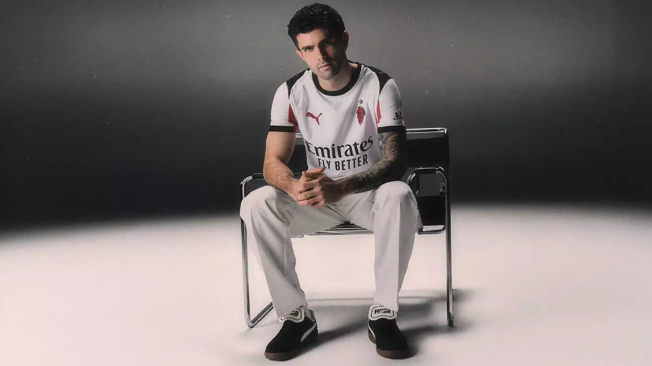
The Star Power and Cultural Implications
Modelled by Christian Pulisic, the kit garners international attention, especially as he exudes a fashionable, almost detached “Blue Steel” stance that lends an air of sophistication and coolness. Such marketing choices suggest that Milan is not just selling a shirt but a narrative—a connection to global art and fashion influences. Nevertheless, some fans might interpret this as a marketing stunt that undermines the emotional weight attached to the club’s symbols. The kit’s design, infused with historical references yet lacking daring innovation, embodies a tension between respecting tradition and embracing modern marketing strategies.
A Question of Quality and Aesthetics
Lastly, comparison to previous seasons’ kits reveals potential trade-offs. Many supporters adored last year’s polo-collared away jersey, which exuded elegance and uniqueness. In contrast, this new iteration feels like a step back in style, possibly sacrificing aesthetic refinement for simplistic storytelling. This raises a provocative critique: While heritage-inspired designs are essential, they should elevate, not diminish, the visual appeal of club kits—an aspect that Milan’s latest offering might overlook. Ultimately, the true test for this kit lies in whether fans will embrace its sentimental significance or dismiss it as a missed opportunity for innovation.